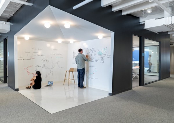
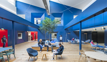
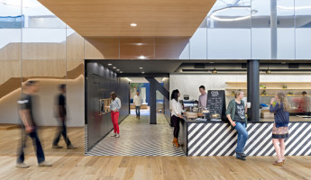
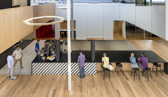
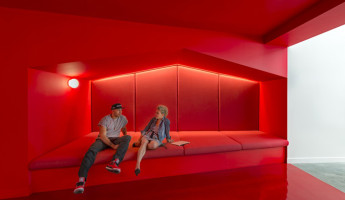
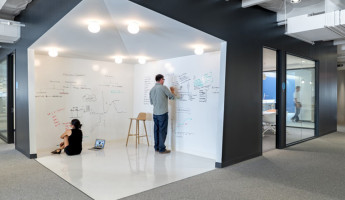
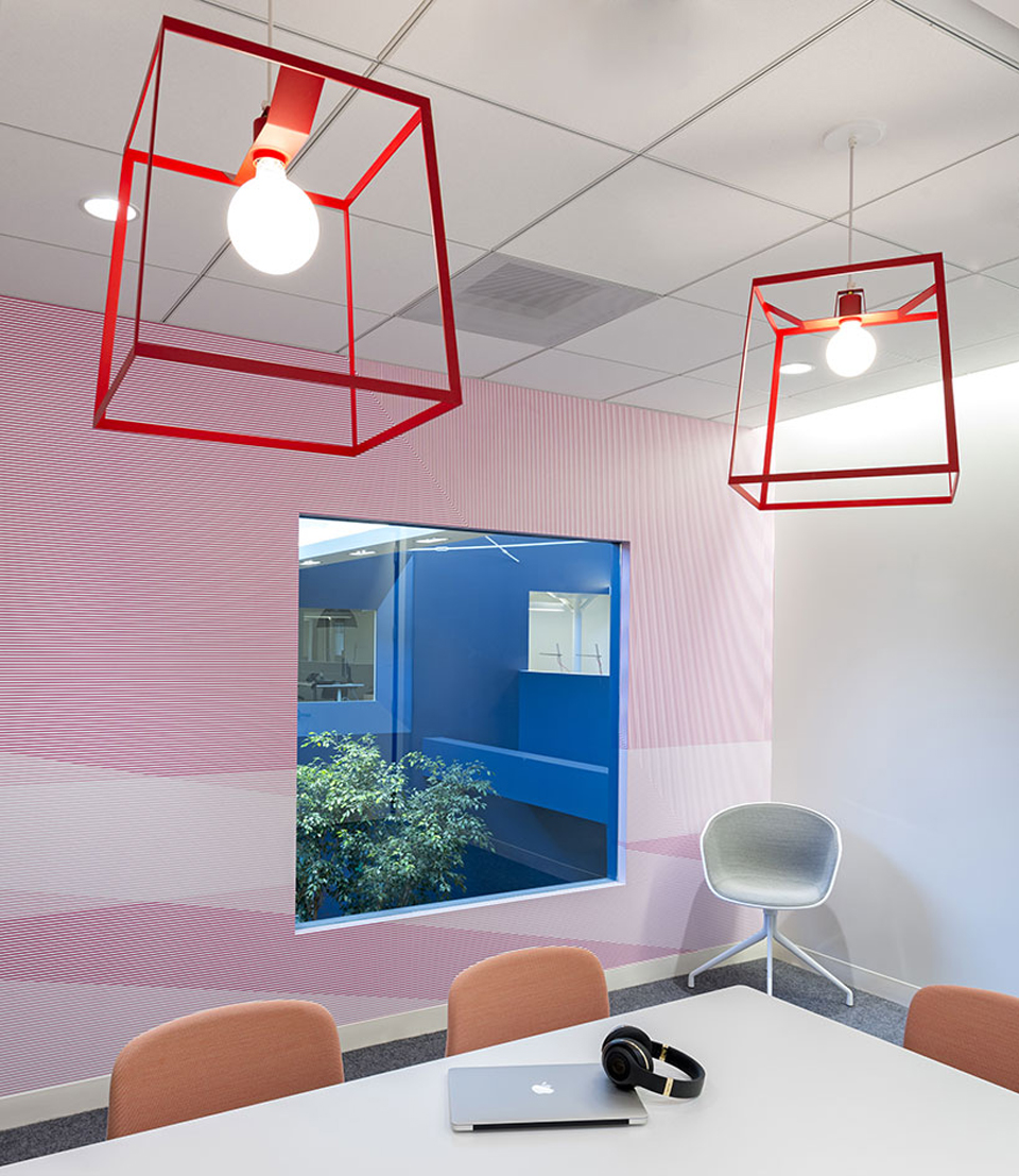
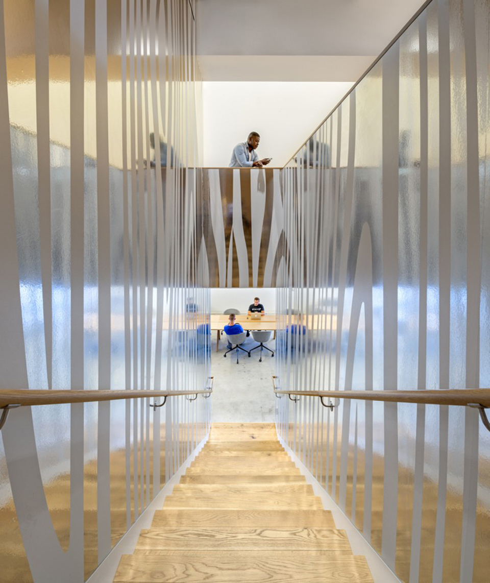
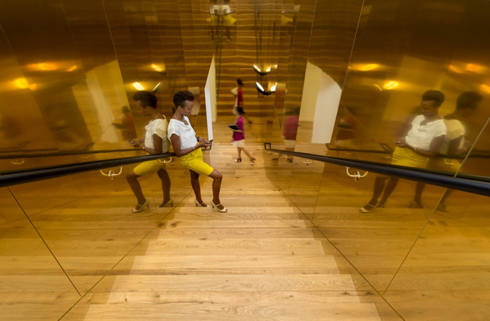
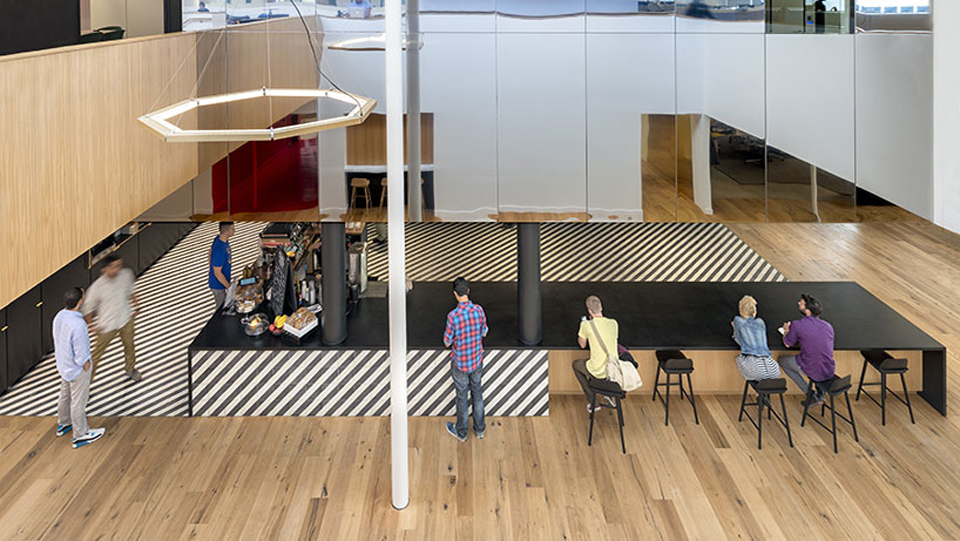
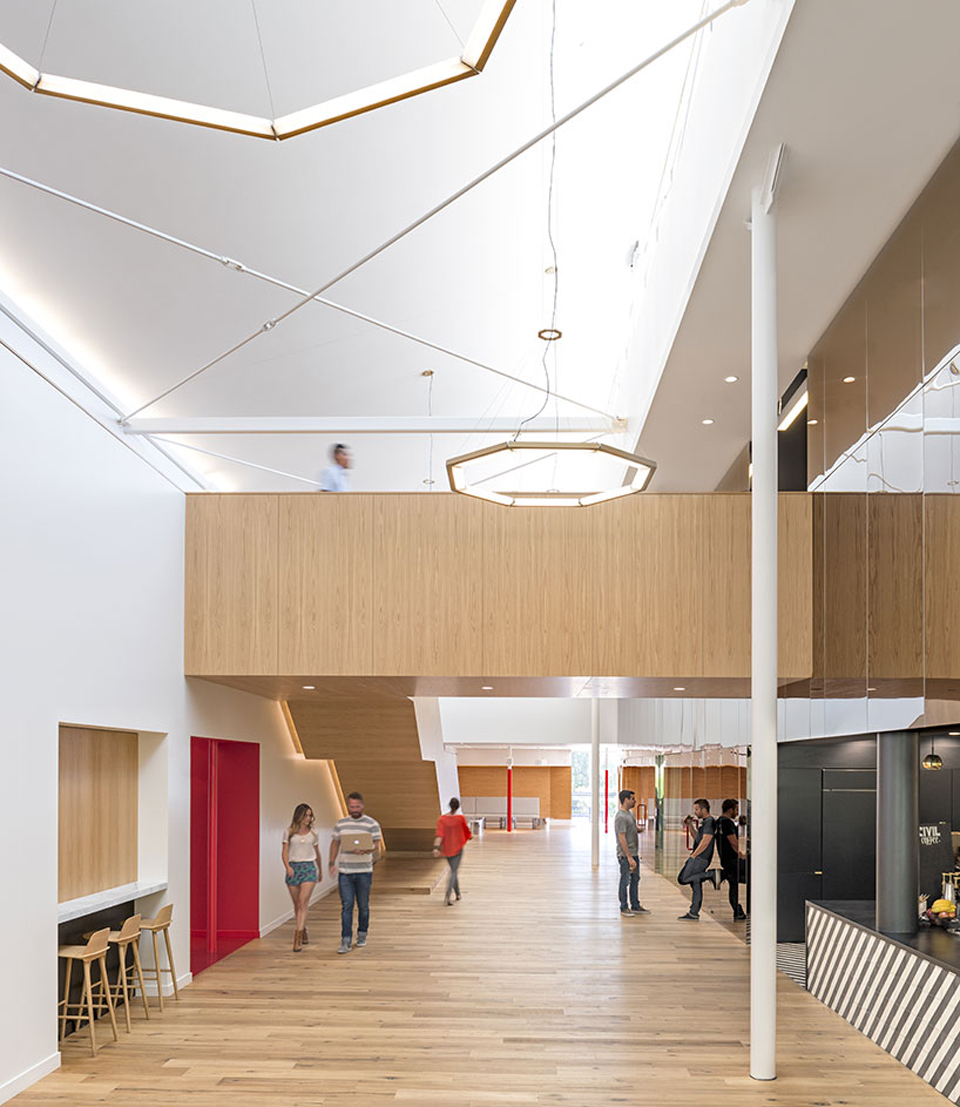
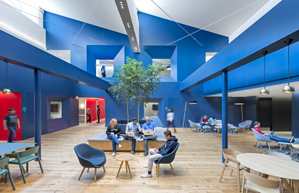
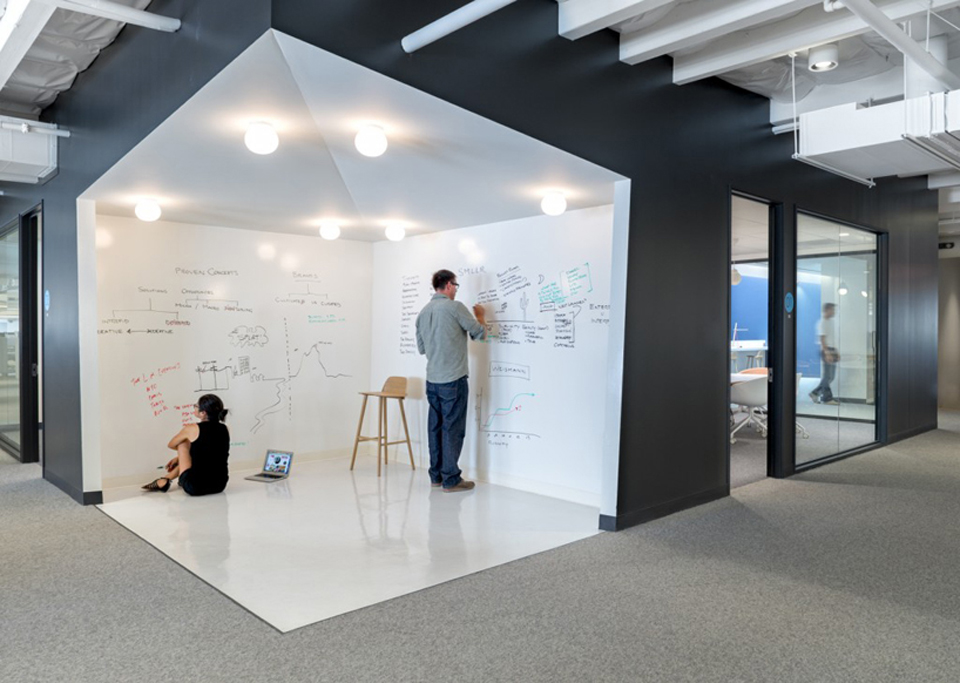
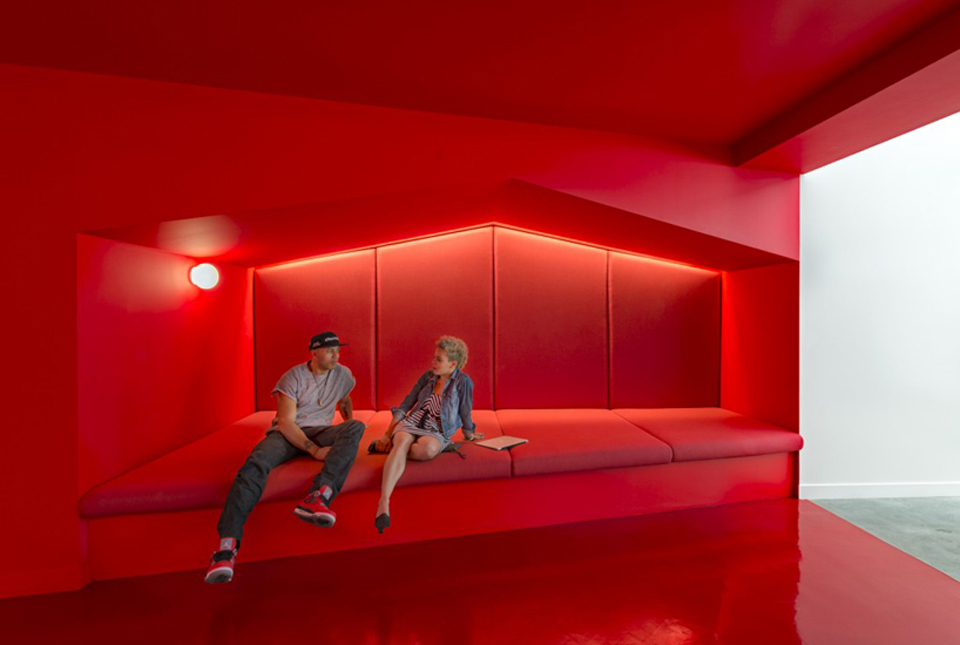
A lot of architects go for fun and games when they design office headquarters in Silicon Valley, but Bestor Architecture wanted to go for a more mature theme in the Beats by Dre Headquarters in LA. Recently acquired by Apple for $3 billion, the company’s 105,000-square-foot space is bursting with color and irregular shapes. The corridors are packed with seating, skylights and atriums ensure plenty of natural light, while open-plan zones offer plenty of space for co-working and brainstorming.
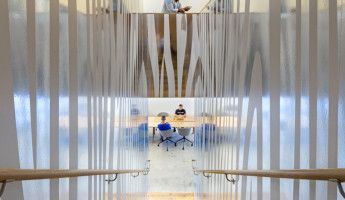
Home to 650 employees, the Beats By Dre Headquarters building is located in Culver City, just west of Los Angeles, and was built with the help of workplace consultants Loescher Meachem Architects. “The design reflects the varied nature of [the company’s] work from software to hardware, balancing open-plan zones with ample collaborative co-working zones woven through the core of the building,” said the architects. While some of the areas feature bright colors such as blue and pink, there are also plenty of spaces filled with wood and white walls for a more mature atmosphere.
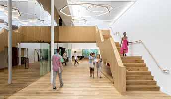
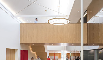
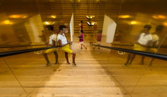
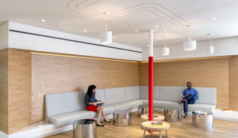
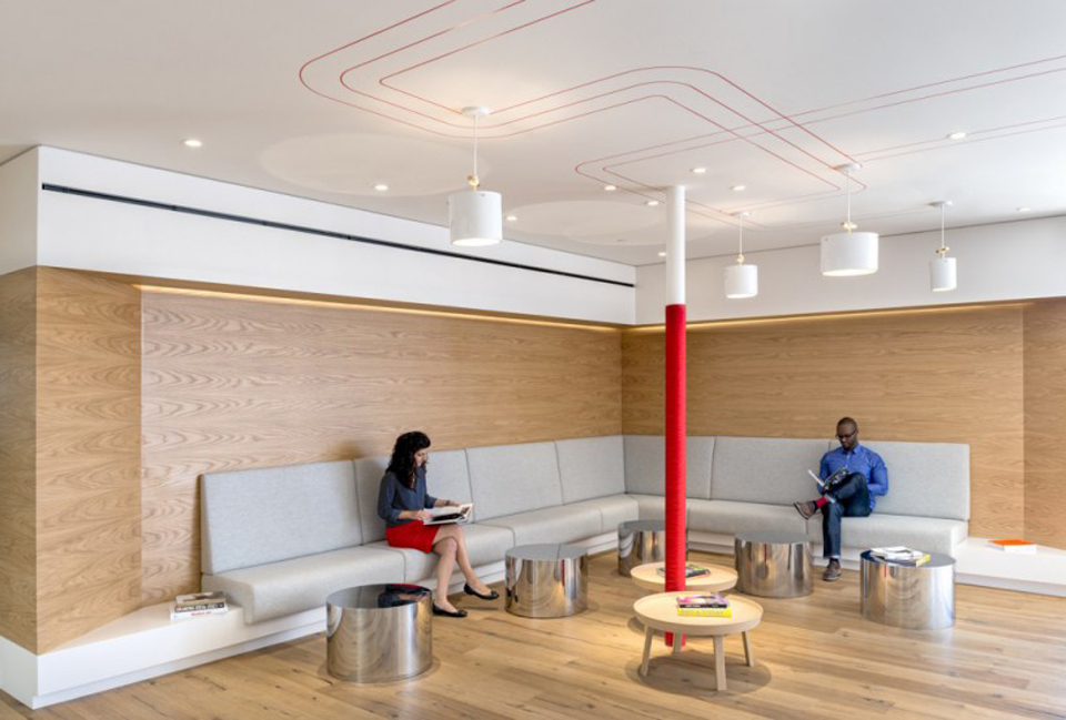
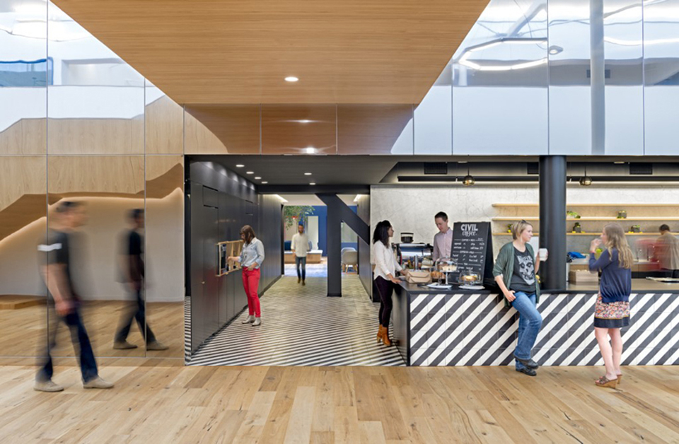
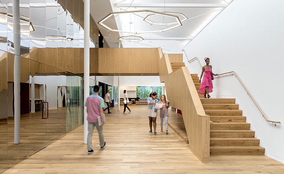
Wood was an important element to make sure the office felt more like a home than a place of confinement. “There is a certain tactility that comes from using natural materials that brings a sense of comfort to the environment. We wanted people to feel at home in the office in order to use the space as best as possible,” project designer Daniel Rabin told Dezeen. Another interesting feature is the use of furniture from up-and-coming designers, mainly those who have some traction in Europe.
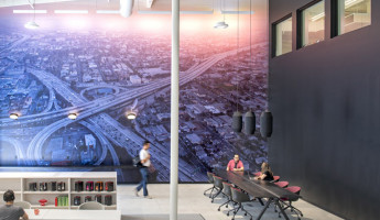
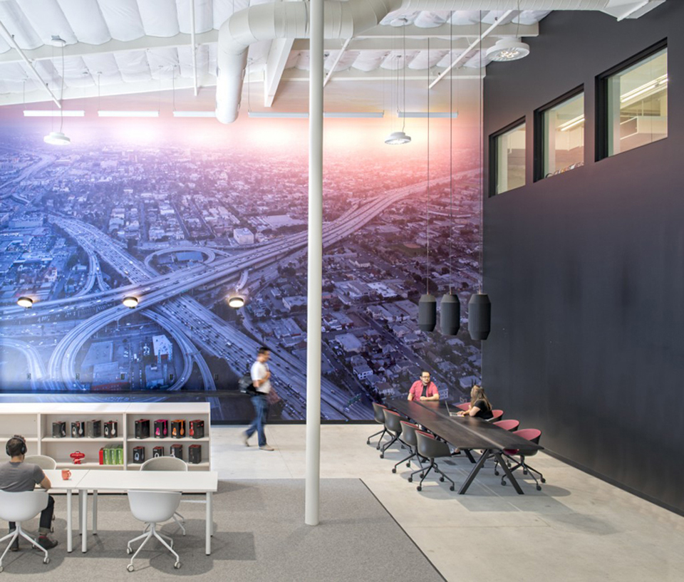
Finally, a giant aerial photograph of LA by Iwan Baan has been plastered across one of the walls, while smaller cityscapes are also littered around the office – which is probably an attempt to instil the employees with a sense of pride for LA. [photography by Jasper Sanidad]
View in gallery View in gallery
 View in gallery
View in gallery



It looks ‘cool’ at first glance, but thinking about how it might be to work there, ‘meh!’ A clear lack of seats and the seats they do have in the communial area look really uncomfy. It’s a bad place to get a bad back.
Clearly there is a lack of research, because stripes are used in nature to confuse hunters that might be looking in their direction, for example Zebra’s in a large pack all blend into each other making it look like one big blob to, tigers in long gray to blend in etc etc. It has a dizzying effect and should be avoided in a place of work.
And to use blood red? SERIOUSLY?
looks like my house. love it. it’s nice to walk into a room + have the whole vibration change.
The spaces don’t seem consistent.
It feels deliberate to me. I think the variation is intentional, used to separate spaces based on their utility.