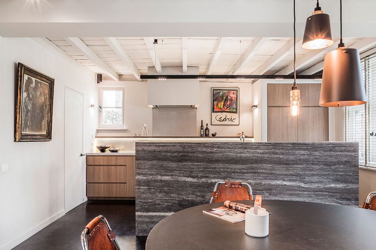
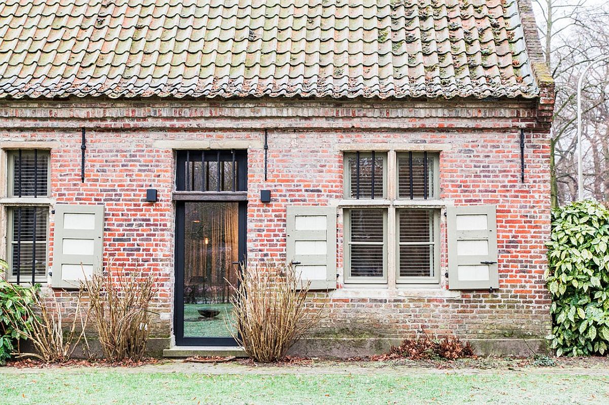
If you’ve ever been in an outdated, traditional farmhouse, you might have noticed a dark, crowded interior. Although many vintage country homes have charm, the primary appeal often applies mostly to the outside of the house, where a little wear and tear looks stylish and historic. On the inside, however, most home buyers prefer a touch of modernization, bright and open concepts, and a clean aesthetic. That’s just what Juma Architects hoped to achieve when they transformed Project B, a beautiful old farmhouse in Belgium, into the gorgeously modernized interior dream it is today!
View in gallery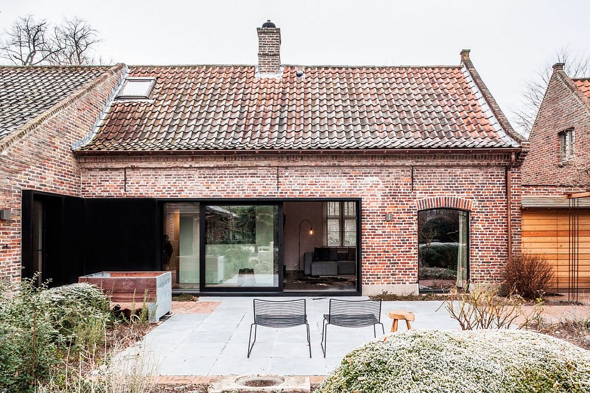
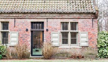
The primary goal of the designers and architects on this project was to blend the functionality and modern style of a brand new exterior with the gorgeously rustic farmhouse exterior, full of vintage charm and traditional grace. Without erasing the history of the building, designers removed unnecessary partitions in an attempt to open up both the floor plan and the flow of lighting throughout the home. The different a bit of light and some space can make it astonishing!
View in gallery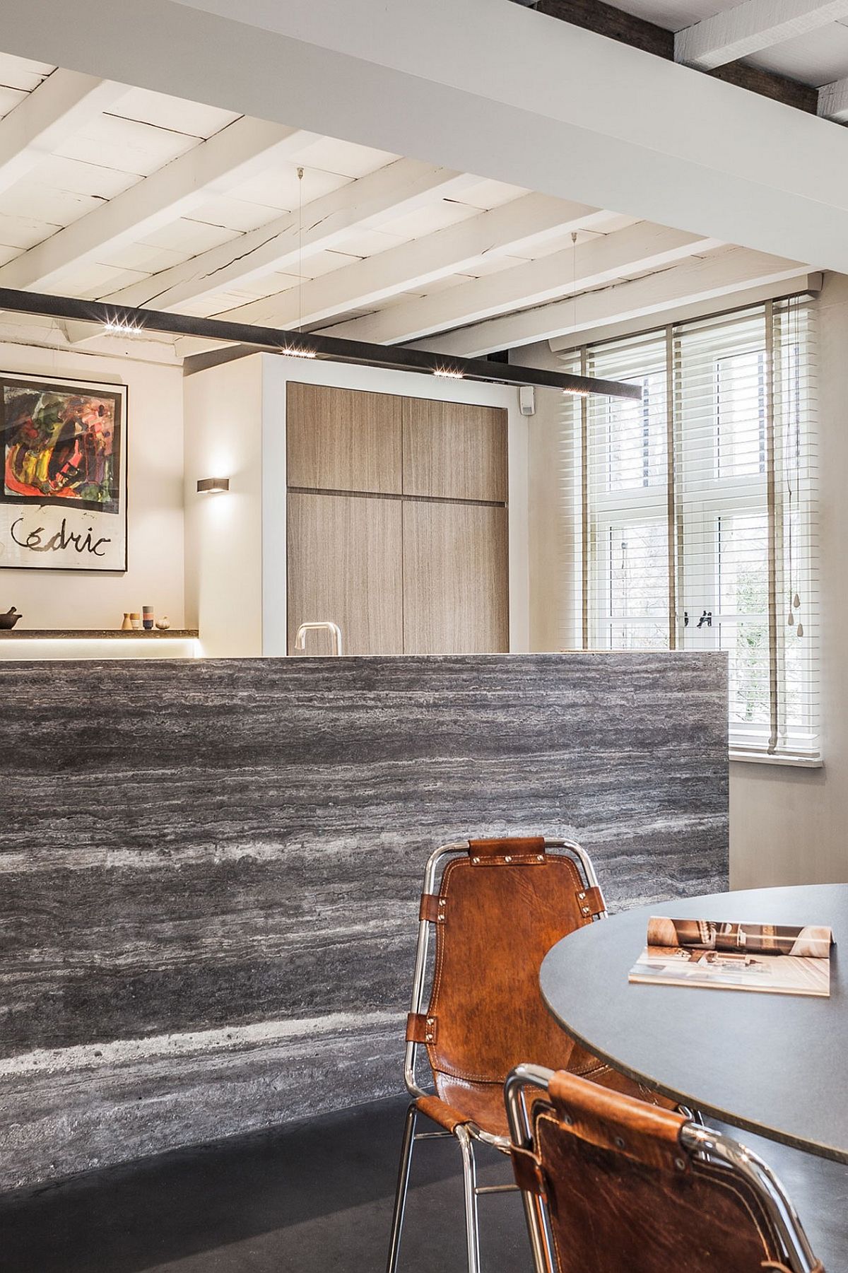 View in gallery
 View in gallery
 View in gallery
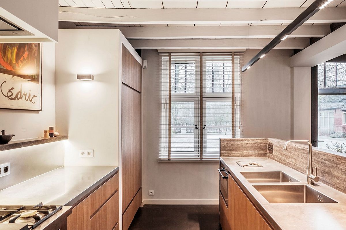
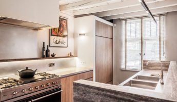
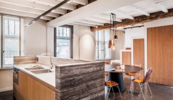
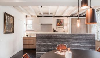
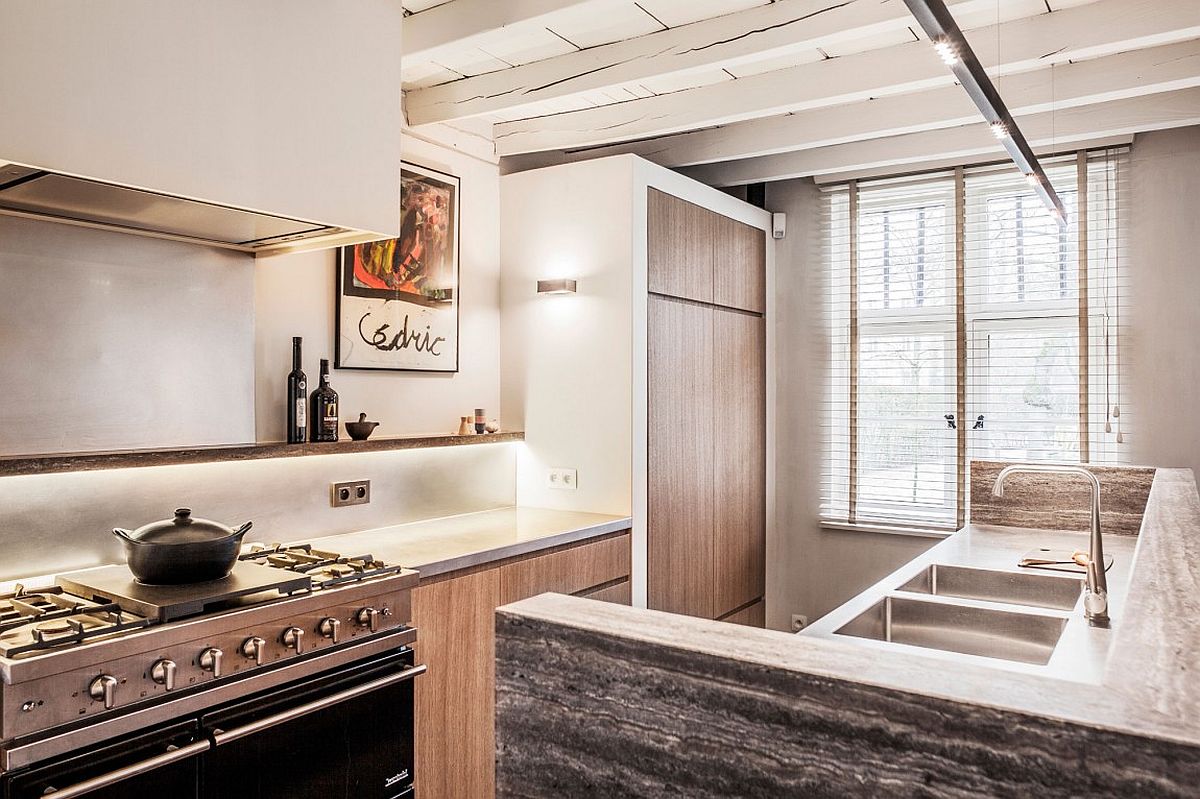
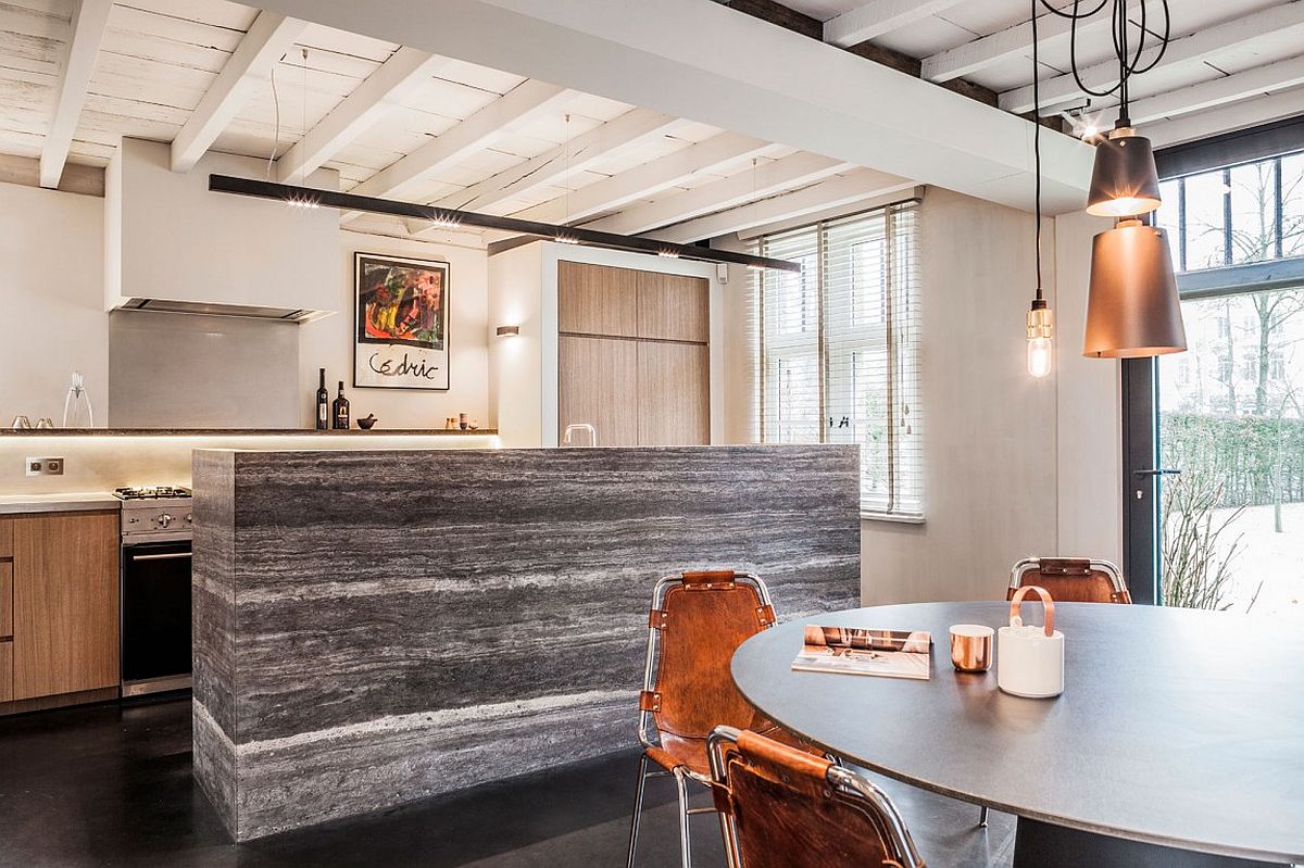
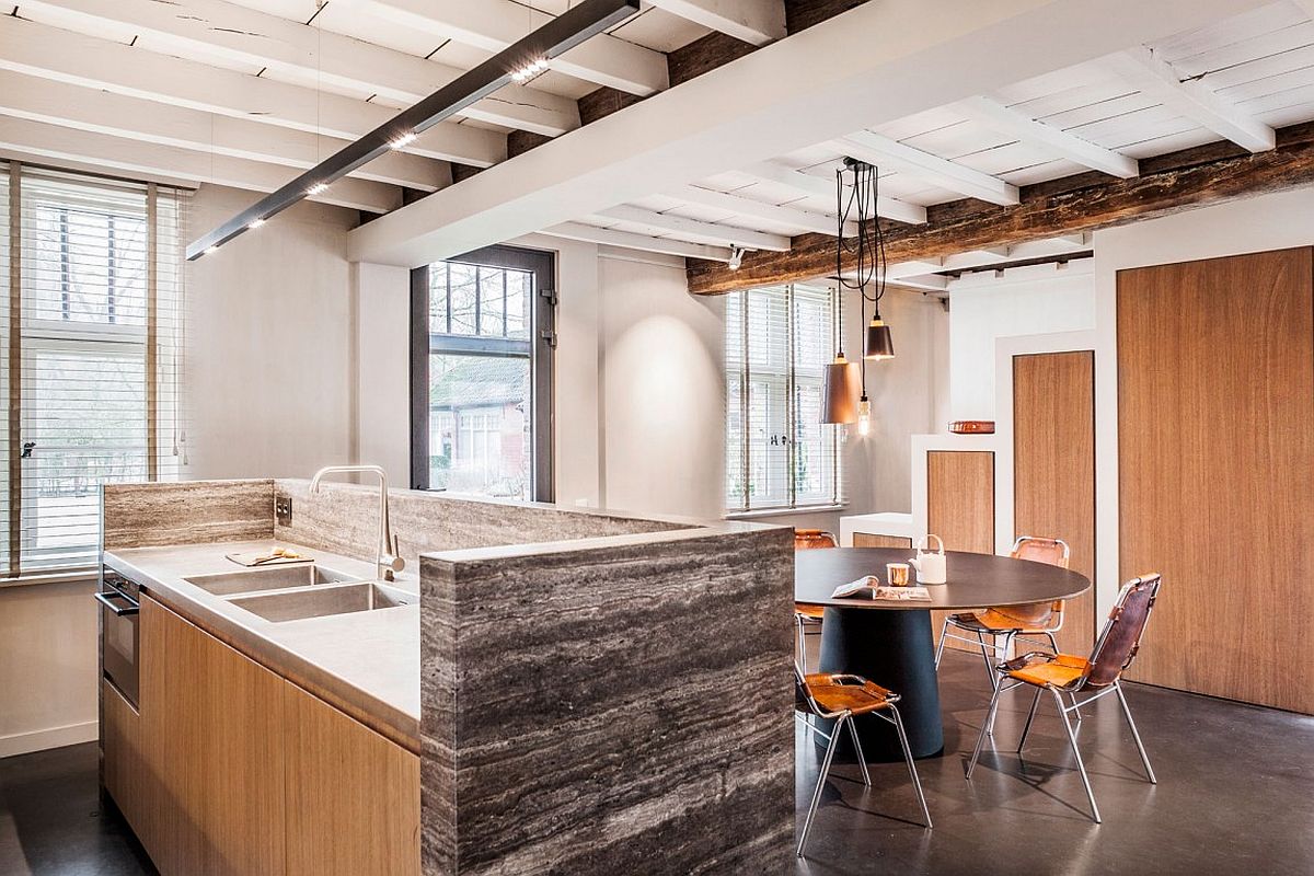
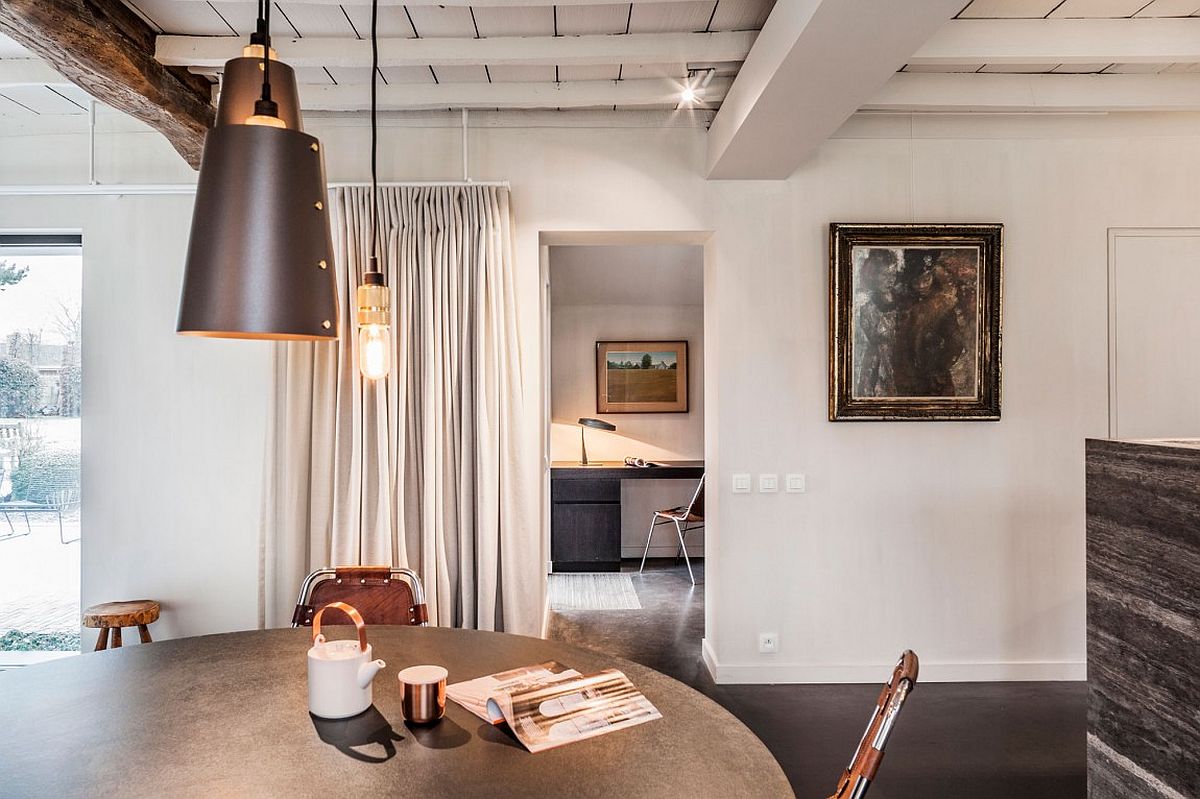
In addition, designers tried to create more space for organization. Instead of leaving the kitchen completely open concept, they build a stunning natural stone island that provides extra counter space and gorgeous oak veneer cupboards right across from the original, still functional stove area.
View in gallery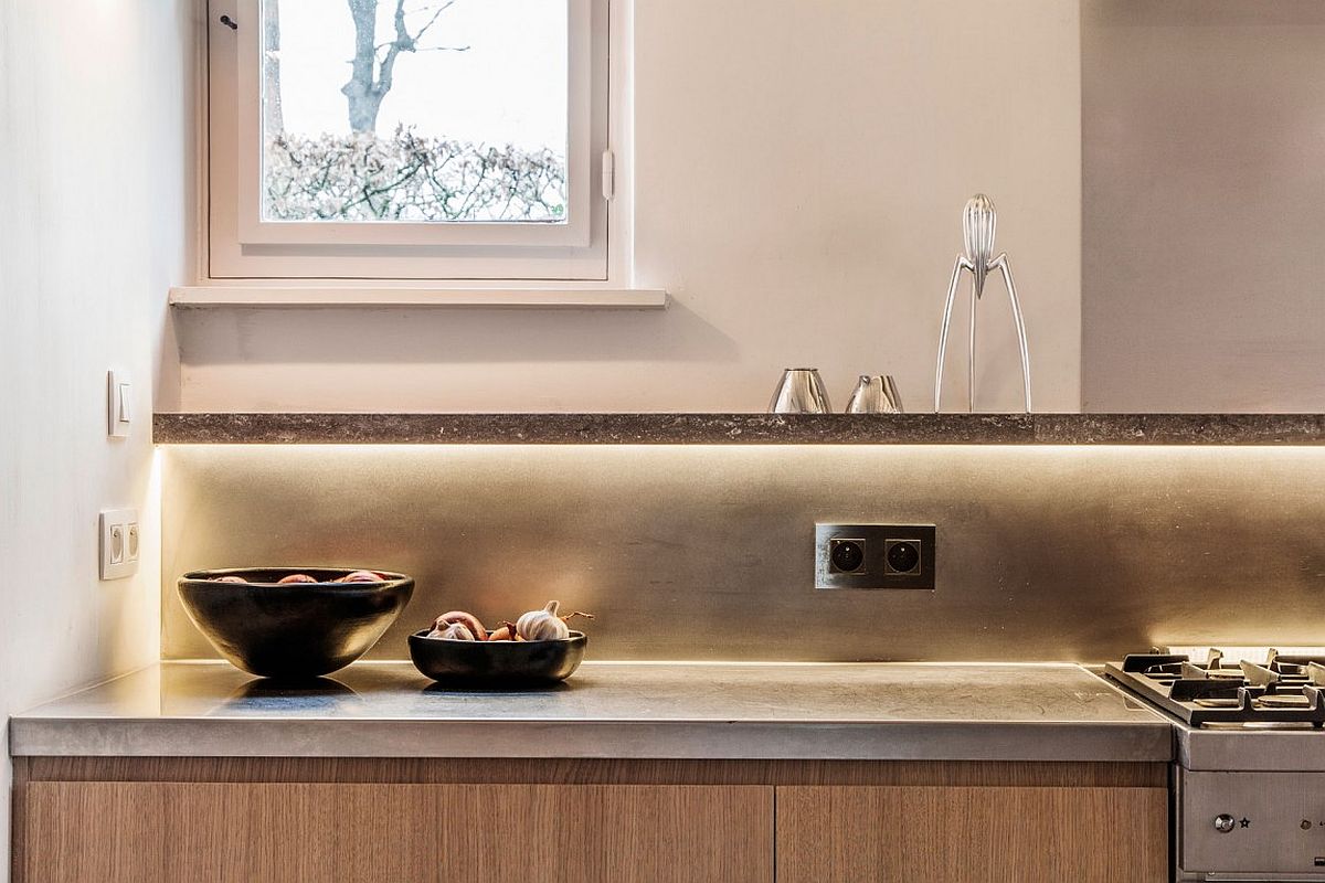 View in gallery
 View in gallery
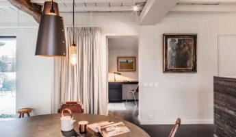
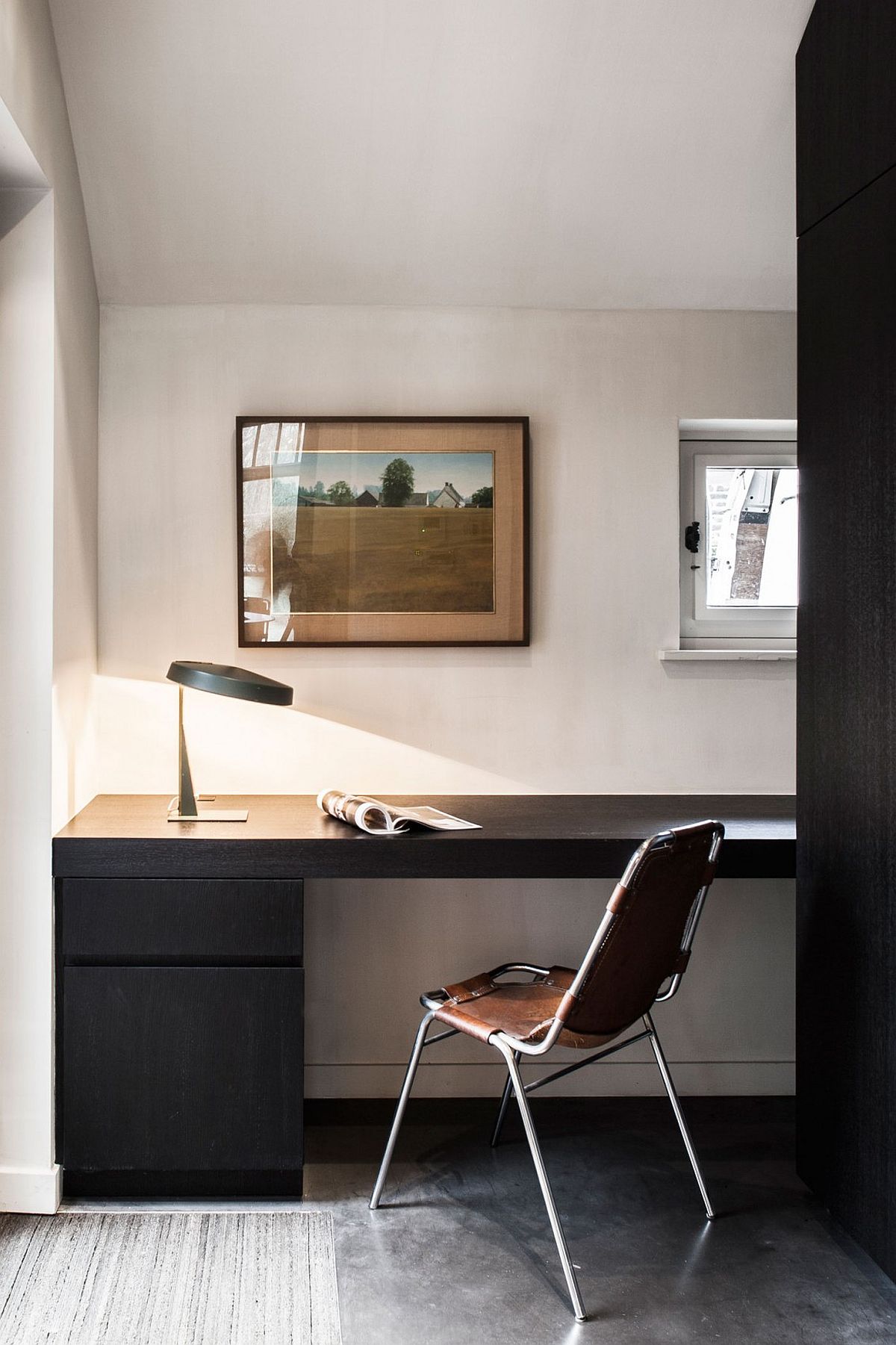
They also added an awesomely customized staircase to the second floor, turning the underside of the stairs into more oak storage so that the kitchen and its cozy but bright seating area can stay clutter free. looking across the kitchen from the stove, you can see a smaller room featuring a desk and a chair but not much else. This simply stylish and very modernized little space is, believe it or not, what used to be the original kitchen! When the new, gorgeously spacious kitchen was added, however, the smaller room was transformed into a private study area, perfect for when the ample space in the rest of the home gets to feel a little overwhelming.
View in gallery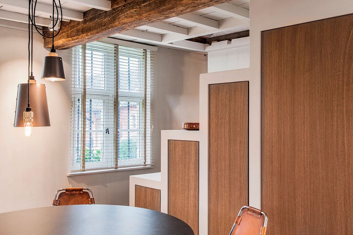 View in gallery
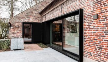
Perhaps the most dramatic difference to the home besides the kitchen is the addition of a large, very modern looking sliding door with a stylishly dramatic black frame. The sliding glass door leads onto an original stonework back patio. Besides making the home feel more open due to the increased accessibility to the gorgeous country outdoors, it also brights the space up simply by way of letting more light into the interior of the home.
View in gallery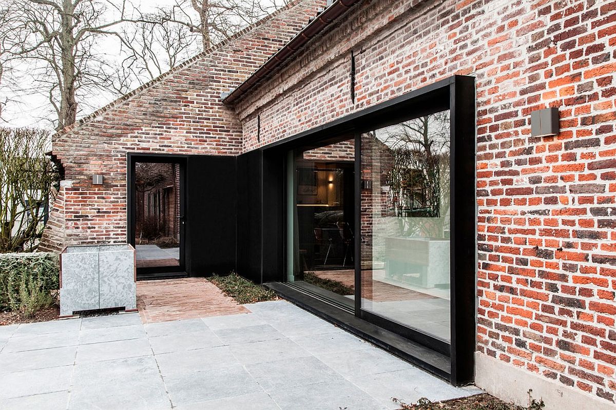 View in gallery
 View in gallery
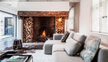
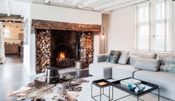
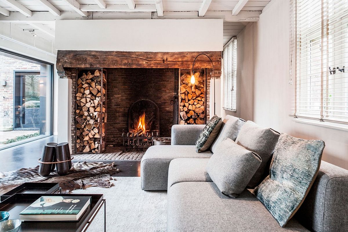
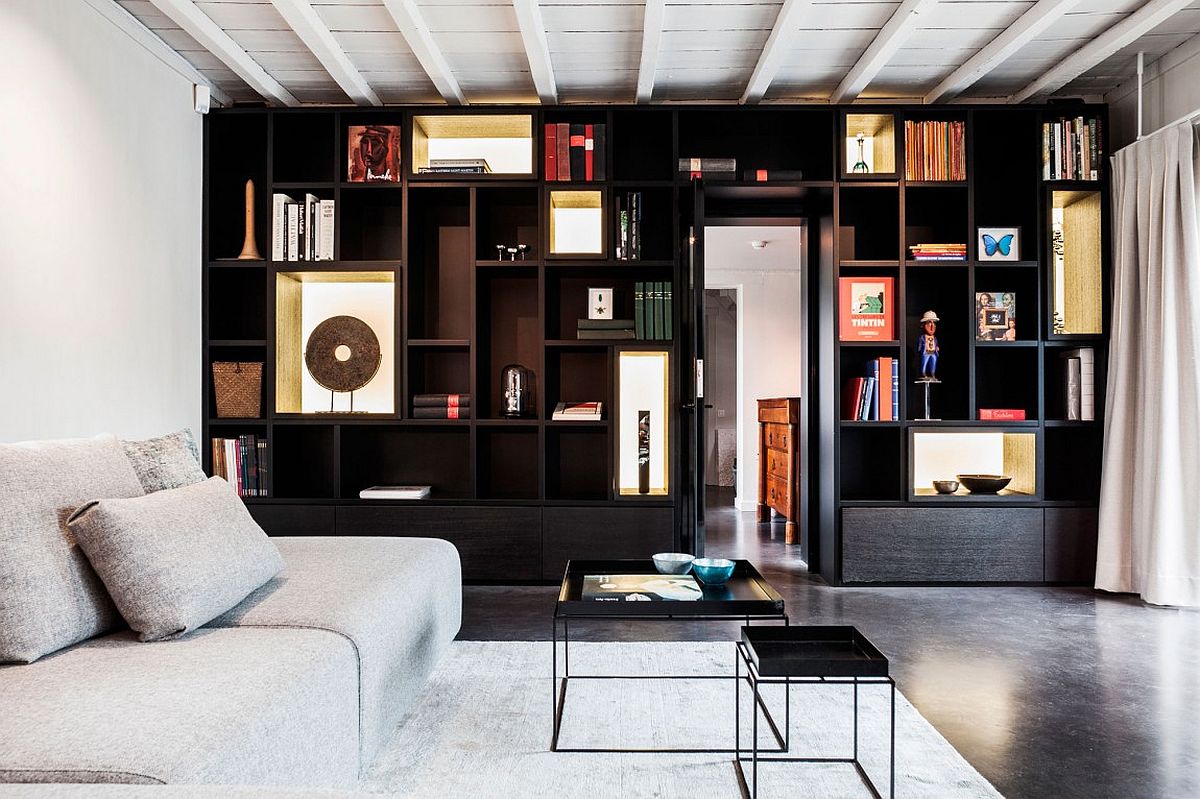
Moving inside but away from the kitchen, you’ll find a glorious fireplace with wood logs stacked high on either side. Astonishingly, and although it looks like a stylish piece that’s been added recently but with a rustic intention, this fire place is actually one of the centre features of the original home. Between that and the gorgeous floor to ceiling shelving units across the way, the central living space of the home has undergone an equally beautiful transformation to the rest!
View in gallery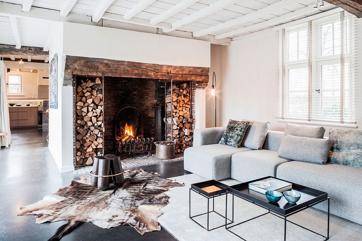 View in gallery
If you’d like to learn more about the talented team who transformed this gorgeous old home into something deliciously modern without losing its original charm, check out their website!
