Have you ever noticed that – in spite of all the advanced technology that’s been going into modern cars – their multimedia systems are woefully outdated? Aside from a few shiny new electronic components, the radios of today have changed very little from those of ten or twenty years ago. Search your feelings, you know it to be true: most in-car entertainment systems are still analog-only, with an ever-expanding array of levers and knobs, all of which makes driving significantly more complicated than it needs to be. There are some exceptions to this rule, namely the proprietary systems we’ve seen like MyLink and others, but for the most part– evolution has ground to a halt.
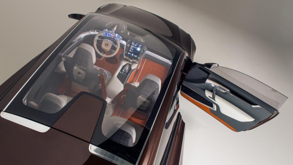
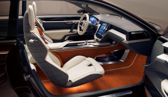
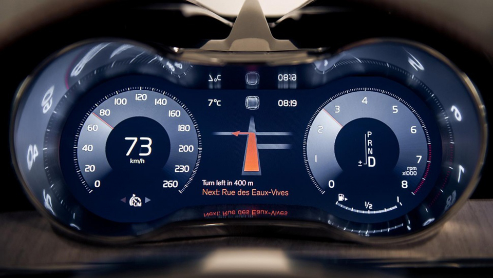
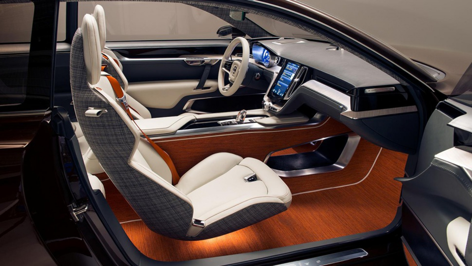
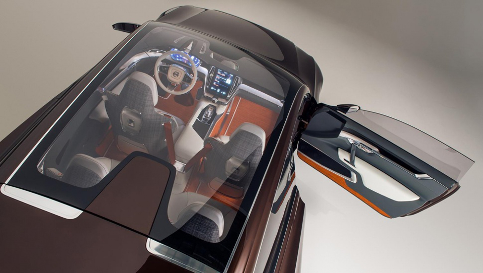
One company is looking to clean up the mess: Volvo. In cooperation with Apple, the Swedish automotive manufacturer has designed a new human-machine interface which could bring about a fundamental change in how we interact with our vehicles while driving. A working prototype of the new system – installed in the Volvo Concept Estate – is currently making the rounds at auto shows all over the world, where it’s showing off what Volvo holds to be the future of driving.
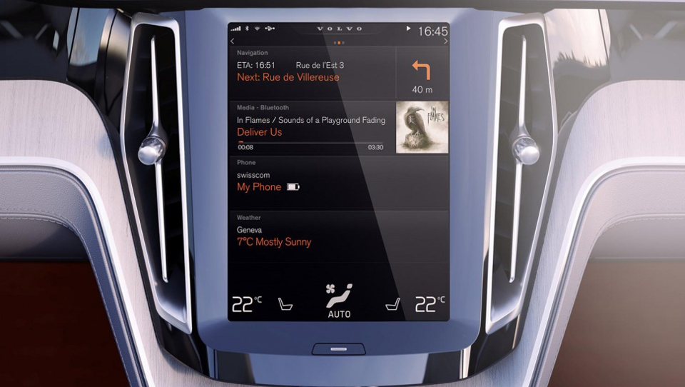
There are only three buttons in Volvo’s new interface, and all three are shortcuts for the media system. Everything else will be done using the touchscreen of an Apple-designed tablet which serves as the centerpiece of the new system. It makes use of a series of touch gestures for what could prove to be an incredibly intuitive interface; this functionality is enabled by a combination of Volvo’s own custom firmware and Apple’s CarPlay (currently unavailable to consumers, and only installed in a few exclusive models from Mercedes-Benz, Ferrari, and Volvo) .
In addition to touch gestures, drivers will be able to control the system through Siri-enabled voice controls. Unfortunately for anyone concerned about distracted driving, it’ll also allow its users to control “certain phone functions” such as phone calls, text messages, and voicemail. I suppose such a development was inevitable, but it’s still a little concerning.
According to Digital Trends, the on-screen display consists of bars for Navigation, Media, Phone, and CarPlay. Tapping the latter of the four will bring up a number of immediately familiar icons, including Spotify, iTunes, iHeartRadio, and Apple maps.
In spite of my concerns about Volvo’s new interface, I can’t help but be at least a little excited about it – after all, it is rather revolutionary. Let’s just hope we”ll be prevented from installing games on it. The rash of car accidents that would occur because of people playing Angry Birds would be overwhelming, to say the least.
View in gallery