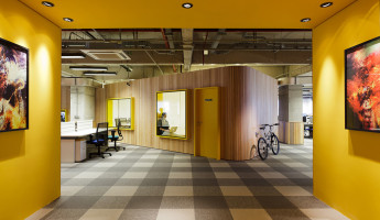
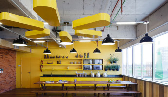
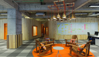
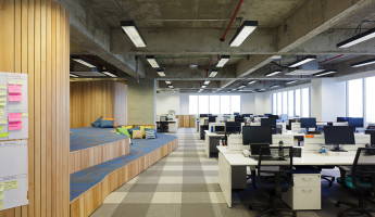
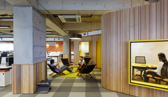
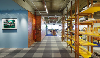
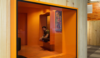
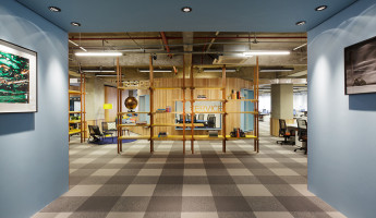
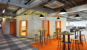
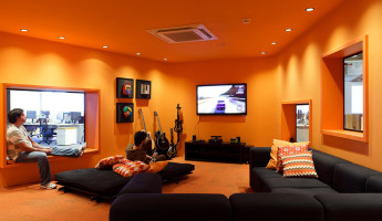
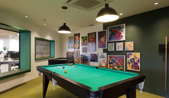
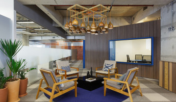
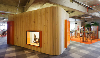
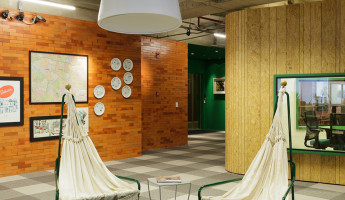
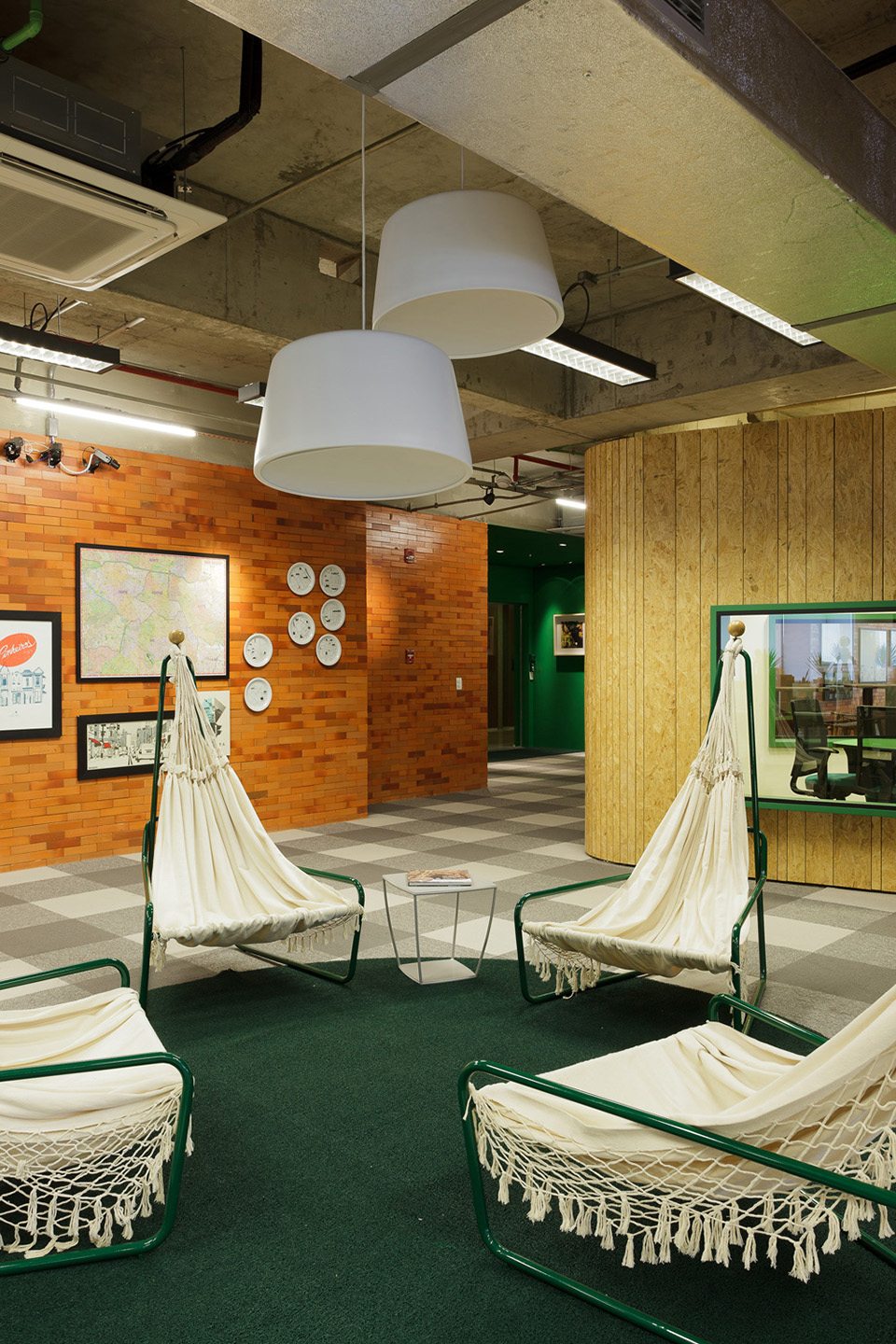
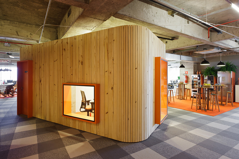
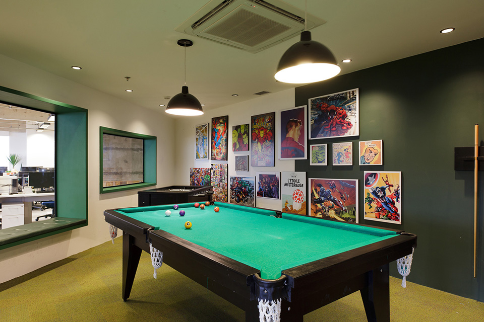
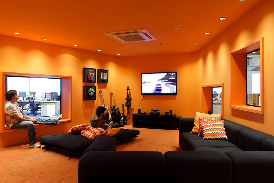
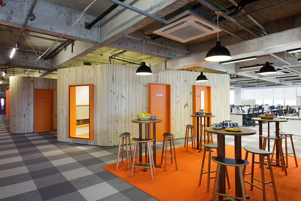
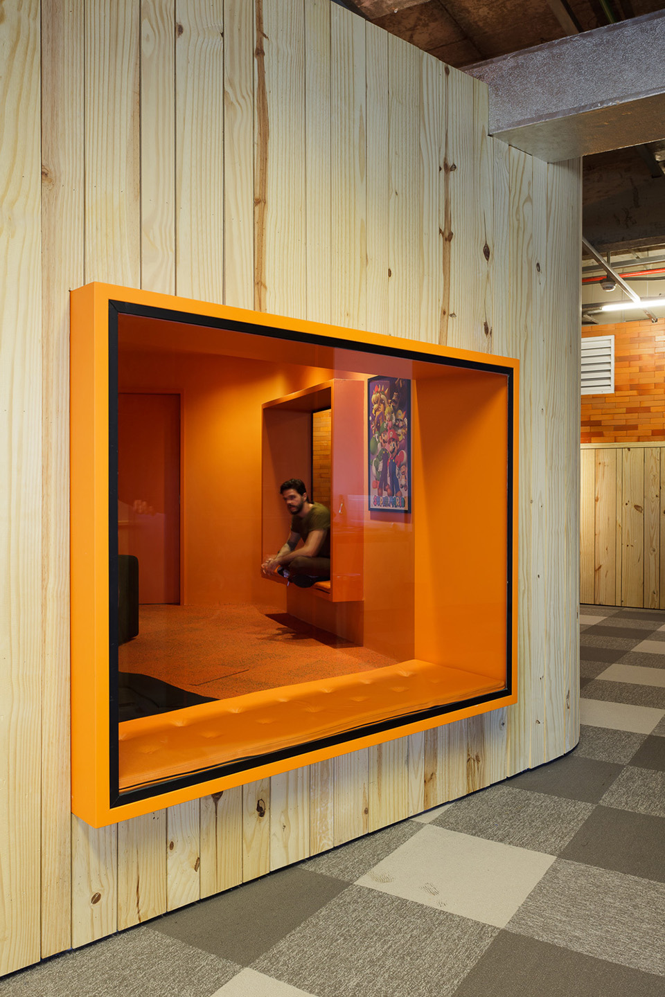
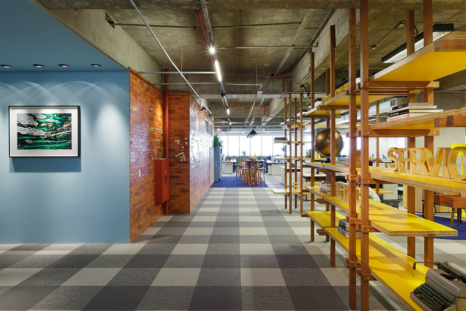
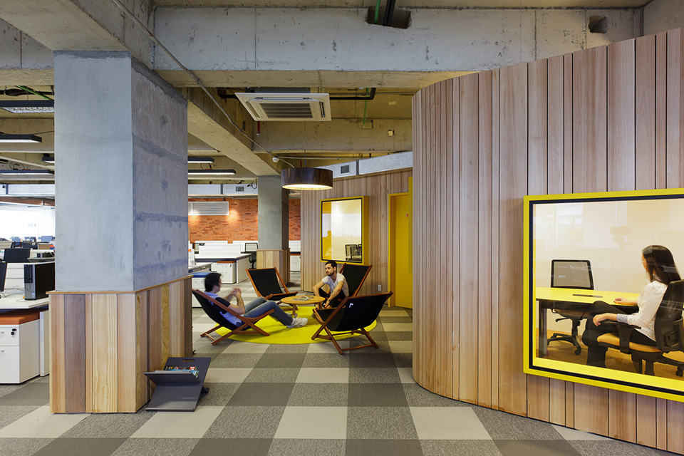
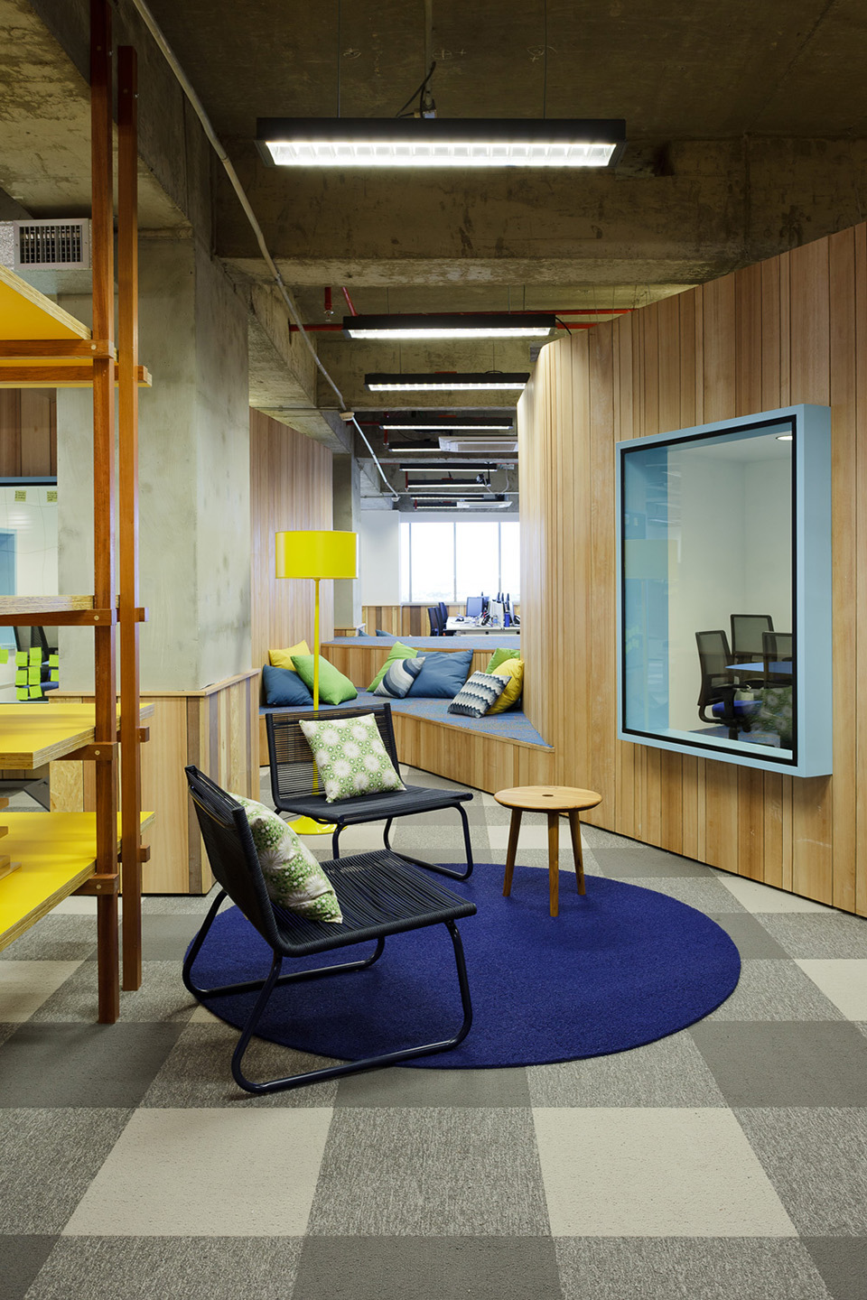
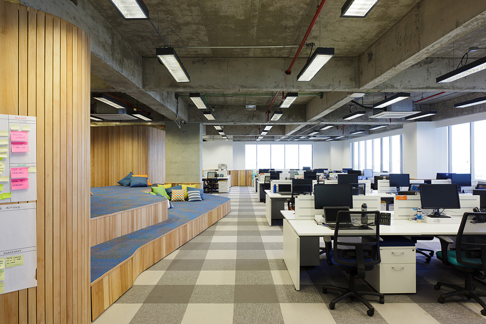
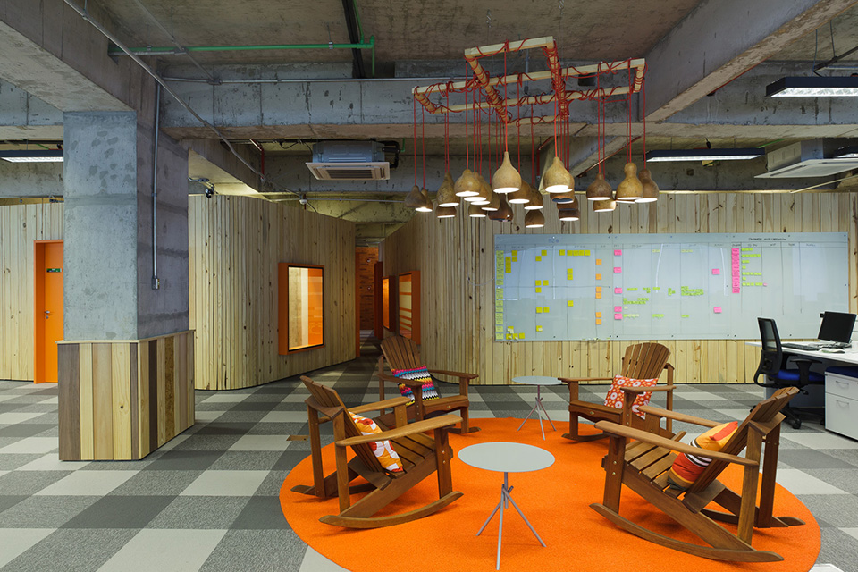
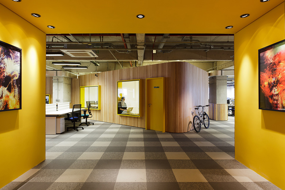
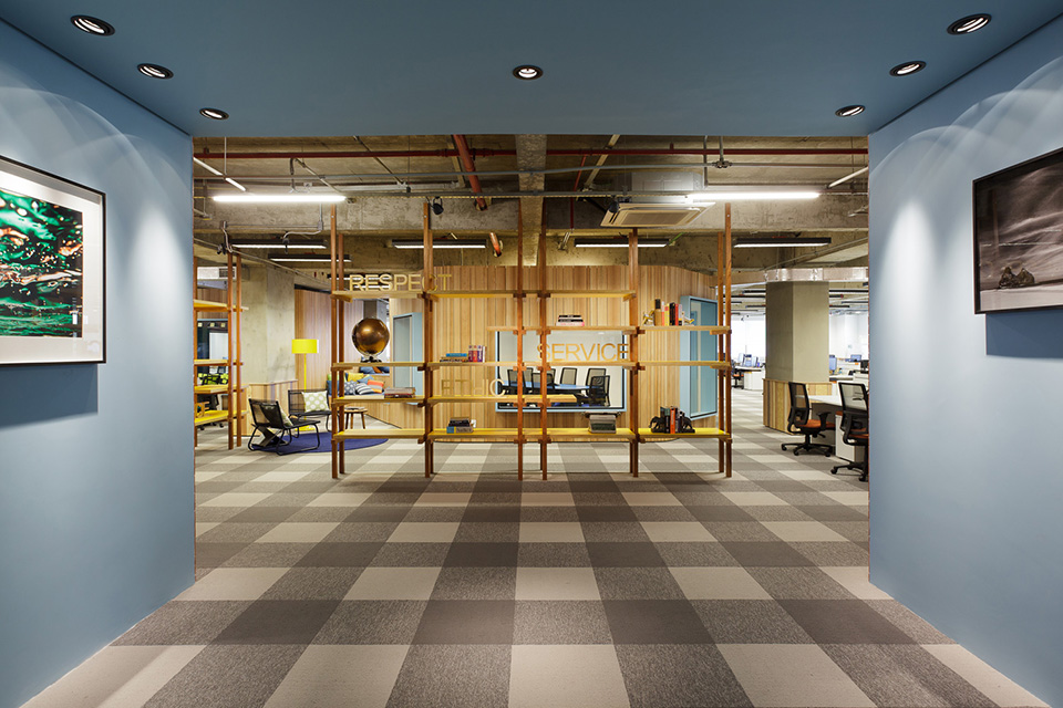
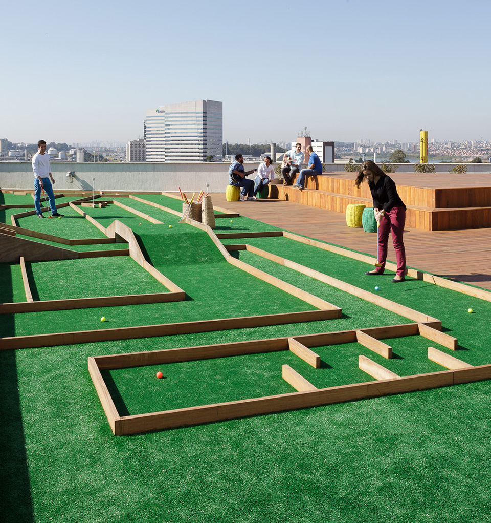
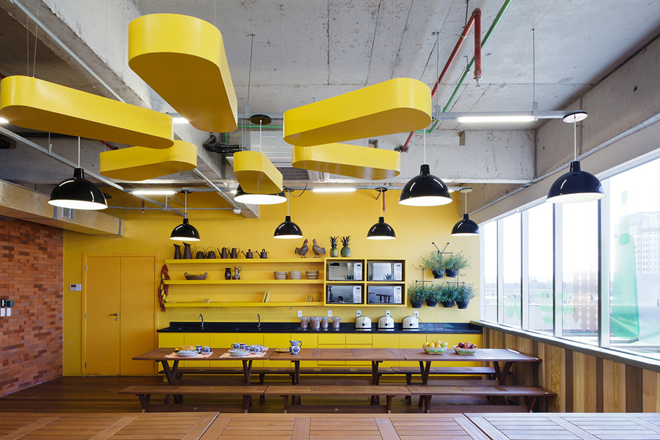
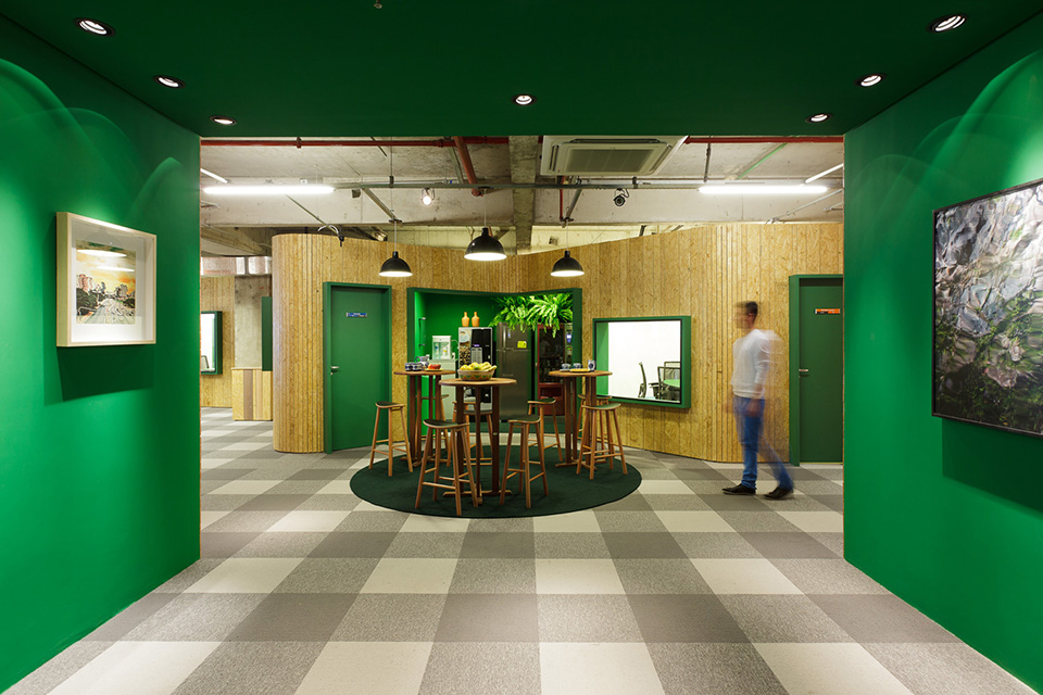
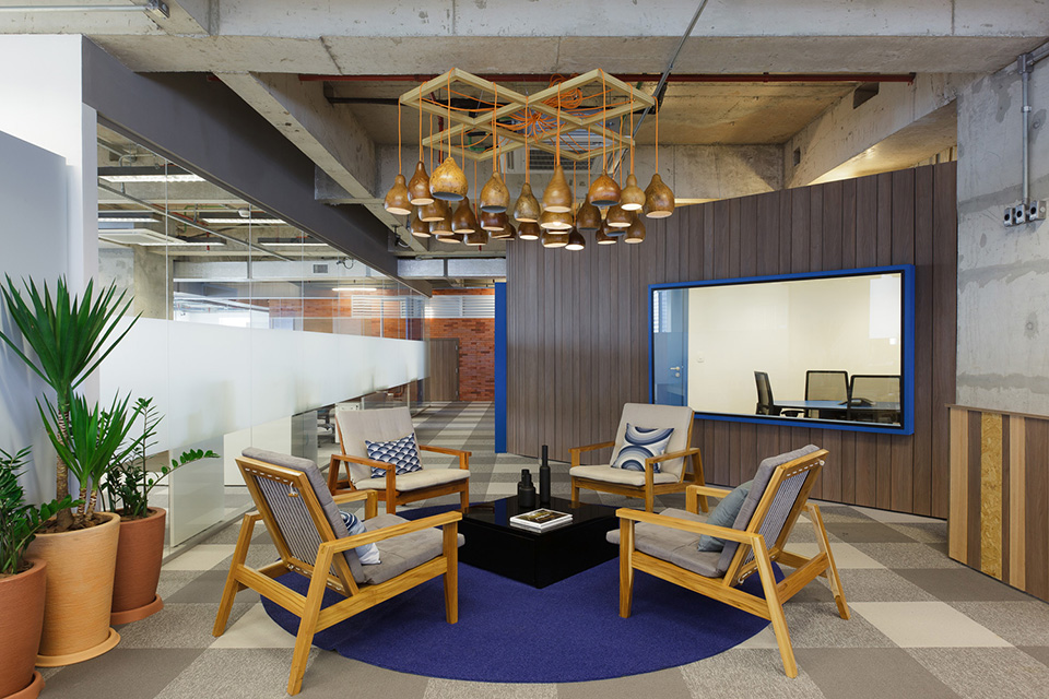
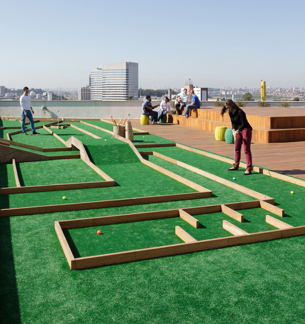
We’re gonna go out on a line here– this is the prettiest Walmart interior we’ve ever seen. The new Walmart Offices of Sao Paulo, Brazil house the company’s web retail staff for South America’s most populous country. This design work by Estudio Guto Requena is bright, inspiring, comfortable and relaxed, dividing a large building into a series of private work spaces and shared areas for social gathering. While the interior does have the common traits of the new digital office, it also features iconography of the country of Brazil and the Walmart brand alike.
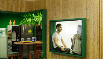
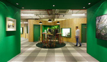
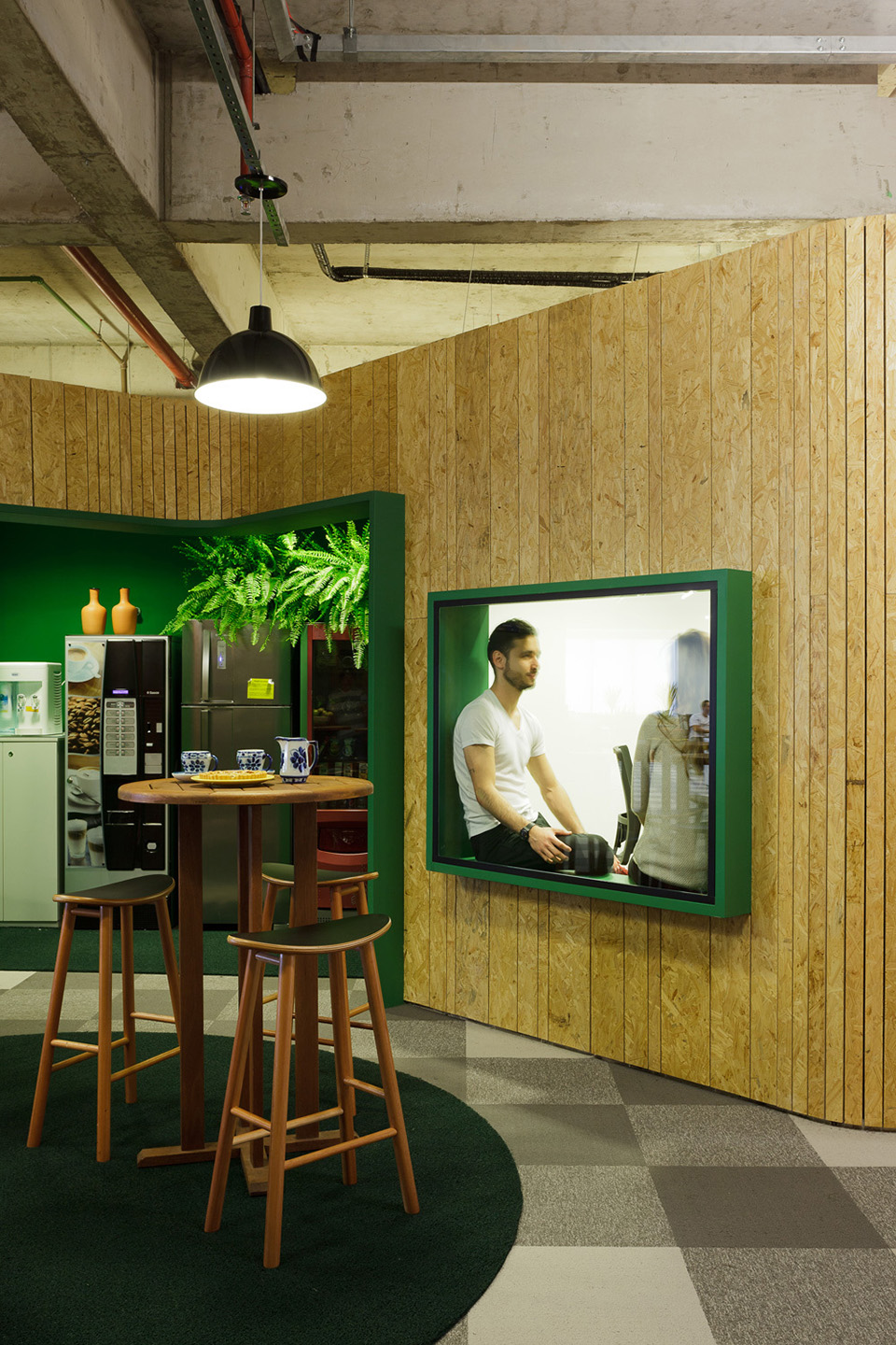
The Walmart Office – Sao Paulo presents a lively appearance with its use of color and greenery throughout. Plants, both as indoor landscaping and little design details for character, provide an emotional connection with the lush outdoor environment around Brazil’s largest city. In addition to the indoor plant life, the designers used large, solid color accents on spaces throughout the not only provide warmth and welcome, they also serve as navigational elements for visitors.
The exposed concrete and utility elements are left untouched as a deliberate design element in much of the building. The natural woods, warm colors and plant life of the Walmart Offices seem to make the concrete feel more natural itself, almost like a cool, neutral stone that appears organically. In total, the look and feel of this design is more residential than commercial, and a homey feeling can serve to make employees and guests feel more welcome and relaxed in this productive work environment. [photography: fran parente]
View in gallery View in gallery
 View in gallery
 View in gallery
 View in gallery
 View in gallery
